Landing Page Optimization
Your landing page is not getting you enough conversions.
We haven’t met yet, but I’m certain of this.
How?
Data proves that you need to be routinely testing and optimizing your landing pages, or you end up losing orders / leads.
The reasons why are:
1: the statistical likelihood is that your landing page isn’t routinely conversion-optimized
2: the usual approach is to just set it and forget it, without ever testing
The best landing pages convert at rates of up to 28 percent. However, the median ranges fall much lower, with most industries experiencing between 2 and 6 percent conversion rates.
Let’s say your landing page has a conversion rate of about 2.35%. Imagine increasing that by just 0.2%. If you have 10,000 daily visitors, that would mean 20 more conversions every day!

Click To Enlarge Image & See Source.
When it comes to landing pages, the true measure of success is improvement. If your conversion rates stay the same month after month, you’re not collecting data and using it to optimize your landing pages.
Landing page optimization refers to the process of enhancing or improving each element on your landing page to increase conversions.
Instead of redesigning your entire page based solely on a hunch, you use data and anecdotal evidence.
In this article, we’re going to demystify landing page optimizations and show you how to get more conversions.
Why Do You Even Need To Use Landing Pages?
Businesses need to use dedicated landing pages for various traffic sources (e.g., Facebook ads vs organic traffic) as opposed to using a product page or home page.
One of the biggest differences between product pages or home pages vs a landing page is the ability for you to tailor your visitor’s experience from ad click through to conversion.
Visitors coming from different traffic sources have different levels of awareness of your business and different purchase intent, specific landing pages cater to them via different messaging, pricing, products, etc.
If you want to see examples of good landing pages, check out the landing page section on SwipeFile.com.
The bottom line is: Dedicated landing pages provide focused information that will turn more of your traffic into conversions.
How to Optimize A Landing Page
Here are the 7 basic steps we use to create a page from scratch or audit & optimize a current landing page.

1: Research – Identify problems or areas of opportunity using qualitative and quantitative tools
2: Audit – Decide on an area of opportunity or improvement
3: Wireframe – Build a skeletal framework of the landing page to prioritize content and structure
4: Copy – Copywriting content including headline, benefits, features, call to action
5: Design – Visual design and hierarchy including size, space, font, color, contrast, directional cues
6: Implement – Actual coding and development
7: Test – Iterative testing and tweaking according to user feedback
Read on to find out how we go through each and every step of this process! 👇🏻
What Does An Optimized Landing Page Do?
Your landing pages must address the following 7 items.

These are both logical and emotional elements that your landing page must do to help your visitors take action.
1: Concentrate Your Audience On Your Value Proposition
What makes a really good value proposition?
- Clarity. Your message could not possibly be misinterpreted & can be understood in 5 seconds: If you do X, you will get Y or you will avoid Z.
- Show the concrete results your audience will get.
- Show the uniqueness of your offer.
- Avoid hype (like ‘never seen before amazing miracle product’), superlatives (‘best’) & jargon (‘value-added’).
2: Inform Your Audience
Display your offer’s facts and benefits, & simulate the experience as closely as possible. Answer the first things your audience asks themselves.
Visitors need to immediately understand:
- The concept of your offering.
- Show exactly what you are offering in a way that makes sense.
- What is this exactly? / What’s the quality like? / Can I test it? Where can I learn more / Can I look inside?
3: Motivate Your Audience
Display the benefits they get in a way that evokes emotions.
Do everything you can to remove stressful states of emotion from your audience, & do everything you can to instill positive emotional states.
4: Show How Easy It Is To Make A Decision
Design your page with a clear singular goal, showing the exact action for your audience to take. Using social influence, show how many others have taken the same step.
5: Show You Can Be Trusted
Use the appropriate aesthetic design for your industry, along with trust icons, certifications of your expertise, and show your realness with images of you or your team.
6: Call To Action
Clearly ask your visitors to take the action you want them to take. Aim to make your page have one primary call to action.
7: Maintain Your Relationship
Use exit-intent popups (with incentives) to capture details so you can build your email list & develop a relationship with your audience.
10 Ways to Get More Conversions With Landing Pages
Now, let’s dive into it. Here are the 10 ways you can optimize your landing pages to get more conversions.

1: Ensure Message Flow
Your ad’s message and your landing page should always be congruent.
They must be aligned, otherwise, cognitive dissonance will occur in the mind of your visitors and they will leave your page.
How do you avoid this? Make sure that the attributes of both the ad and the landing page are matching.
- Headline: Captures attention
- Benefits/Features: Showcases the product’s features & the benefits it offers to your audience
- Credibility: Enhances the trustworthiness of your brand & content by featuring FAQs, testimonials, relevant numbers, etc.
- Expectations: Anticipates your customers’ possible questions on potentially unclear details such as shipping, returns, etc.
- CTA: Persuades users to click & follow through with the goal you want them to achieve
2: Prioritize Above The Fold
Remember the most important thing. The reader is asking, “what’s in it for me?” Answer that question above the fold but ONLY with the primary benefit – aka the unique selling proposition.
This helps to hook users immediately and convince them to convert. Make sure this section contains the following elements:
1: your value proposition & benefit statement
2: your product & service
3: the CTA

3: Visual/Information Hierarchy

A proper visual hierarchy is important when you want your visitors to engage with certain page elements. Visual hierarchy can be achieved by using the following techniques:
- Contrast in size and scale – Drawing attention with larger elements
- Fonts and Colours – Adding boldness or using contrasting (but readable) colors and fonts
- Alignment – Making use of columns & grids to draw attention to important paragraphs
- Page scanning patterns – Choosing a Z-Pattern or an F-Pattern for the copy on your page
4: KISS

KISS – Keep It Simple Stupid. This should be your motto when designing your landing page.
Too many pages overcomplicate things and fail to offer visitors an intuitive course of action.
❌ Here’s a list of things that have no place on your landing page:
- Top or sidebar navigation bar
- Off-page links
- Excessive movements or pop-ups
- Footers or social media links
- Non-relevant content & CTAs
Simplicity is the name of the game.
Landing pages must convert. That’s their only goal.
Whatever goes against simplicity can cause visitors to click away. You don’t want that. Easy does it.
5: Set Expectations, Anticipate Mistakes
Mistakes are part of the human experience.
Your design and copy must set expectations in a way that allows visitors to correctly understand the next course of action.
Widely understood symbols are your best friends.
Your copy alongside a color with a relevant meaning (e.g., green for submit 🟢, red for delete 🔴) will allow you to convey your message more clearly and persuade your visitors to take action.
Ghost buttons also do the job. They can have more than one call to action if you make it easy to process the information.

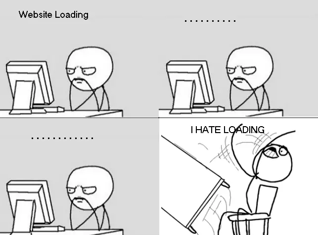
6: Speed Is Key

Someone somewhere once said: “Ain’t nobody got time for that.” We can relate.
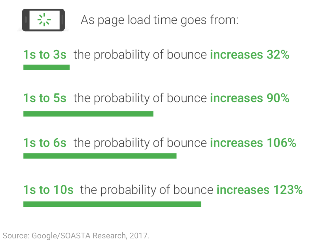
⚡ Your landing page doesn’t have to load at the speed of light. Google recommends that a page should load in at least under 2 seconds.
This is because most visitors get impatient very easily and will be tempted to click off.
A slow landing page will negatively impact your page views, time on page, bounce rate, and ultimately conversions.
Make sure that you take the time to test your landing page on Google PageSpeed Insights. Then, review the opportunities and diagnostics provided.
7: Leverage Cognitive Biases
Testing your landing page (and your ads, offers, content) using cognitive biases is a must.
Here’s a list of cognitive biases.
To use them in testing, it’s as simple as picking any one of the biases from the list, duplicating your landing page so you can A/B test (B is where you add the test element), split your traffic 50/50 to each page, and see which one wins. Then continue doing this with all the other biases that make sense.
Here are the top 5 biases that interfere with purchase decisions:

- Immediate Gratification – Explains humans’ tendency to live in the moment and expect instant feedback. ‘Instant Downloads’ or ‘next day delivery’ are popular because of this.
- Social Proof – Underlines the need humans have for external validation. Recommendations and reviews bring certainty to the purchase decision. 4 or 5-star ratings get more clicks due to popularity.
- Scarcity Bias – Enhances the idea that limited resources are desirable. When your offer is limited by time, it motivates the consumer to take immediate action.
- Authority Bias – Shortens the time dedicated to research or making a decision by basing one’s opinions on people with authority on the subject. Experts and trustworthy individuals can convince the consumer to form an opinion on things.
- Power Of Free – ‘0’ is the magic number that causes the demand to instantly increase compared to any other number that slightly surpasses 0. Free gifts have the power to strengthen any offer.
8: Design For The Right Device (Mobile-First)
Nowadays, most people use their mobile to access the internet. 51% of the global population navigates the internet strictly from their smartphones.
What does this mean? It means that you gotta design for mobile-first!
Here are some tips for designing a great mobile landing page:
- Designing for the smallest screen – remember, everything has to fit without the need to scroll
- Use appropriate, clear fonts & button sizes – it all has to be crammed on a small screen
- Make sure loading time is fast – mobile users have shorter attention spans
- Ensure that navigation is easy – a hamburger menu for mobile and top or side navigation for web

9: Test, Test, Test

You’ve heard it already and I’m saying it again because it’s so important. Test on mobile, web, tablet, and conduct A/B tests for the page elements.
This is how you become aware of any issues that will need fixing.
Always run usability tests with test users from real devices.
See what works and what doesn’t. It’s the only way to make your landing page work effectively.
Google Optimize or Optimizely are free tools we recommend to use — test, test, test.
10: Track Metrics And Tweak
Insights and metrics are just as important when launching your landing page.
Use Hotjar or Google Analytics to understand your visitors’ behaviors.
This will help you to get a closer look at what needs to be improved so that you can convert users efficiently.
Wrapping It All Up

To wrap this all up, these 10 landing page practices will get you more conversions:
-
Ensure Message Flow
-
Prioritize Above The Fold
-
Visual Hierarchy
-
KISS
-
Set Expectations, Anticipate Mistakes
-
Speed Is Key
-
Leverage Cognitive Biases
-
Design For The Right Device (Mobile-First)
-
Test, Test, Test
-
Track Metrics and Tweak
If you want us to do this stuff for you, feel free to get more info from us here:
Click Here To See How We Can Rocket Your Landing Page Conversions

